Reimagining a Brand for Sarah Bennett-Nash
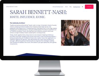
When Sarah approached me about her existing Squarespace website, she was feeling deflated. Her personal brand confident, creative, and sharply defined wasn’t coming through. The previous design leaned heavily into dark navy tones, creating a serious, almost corporate atmosphere that didn’t reflect her voice. Worse still, key elements like her book weren’t being clearly communicated, and the overall structure of the site made it difficult for users to understand what she actually offered.
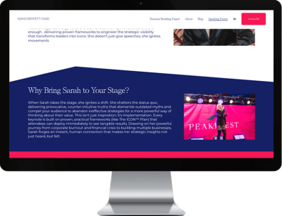
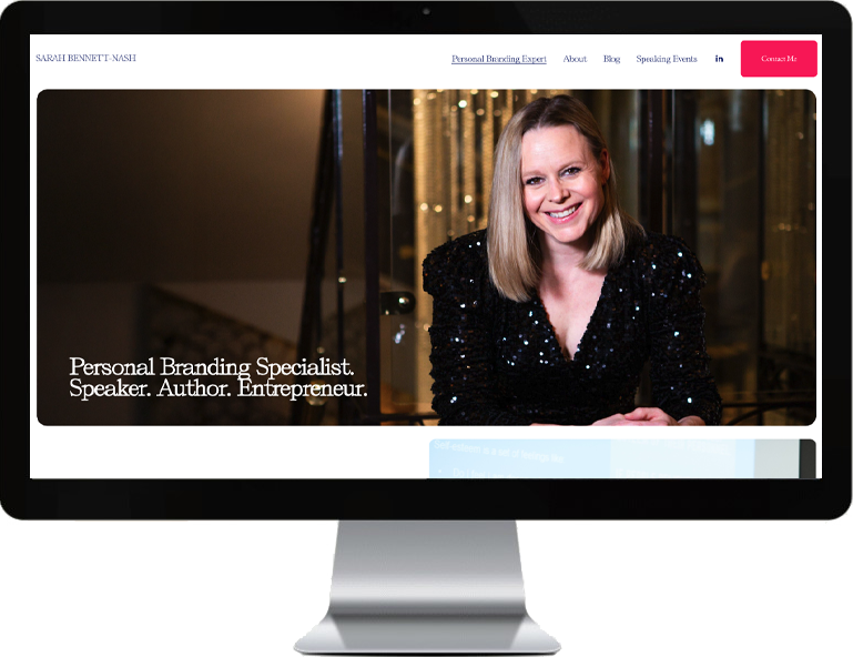
Sarah had a strong brand identity built around hot pink, navy, white, and a soft silver-blue grey but this hadn’t translated into the website. My role was to breathe life back into her site: to strip away the generic template feel, clarify the messaging, and re-centre the design around her bold and articulate personal brand.
Bringing Clarity to Confusion
The challenges were layered, but all rooted in the same issue: the site lacked cohesion.
Unclear Messaging: The copy was dense, with little signposting or hierarchy, which made it difficult for visitors to understand Sarah’s services or expertise at a glance.
Buried Book Promotion: One of Sarah’s core goals was to promote her book — yet it wasn’t even obvious that she had one.
Template Overload: The site was built on a mismatched set of Squarespace templates, many still filled with placeholder text and features that hadn’t been removed or customised.
Visual Mismatch: The image selection didn’t match the tone of the site’s new, more energetic copy — partly because of limited image availability and partly because the structure didn’t allow them to shine.
Working within the constraints of her Squarespace personal plan, I focused on creating structure, clarity, and brand alignment.

Practical Fixes with Maximum Impact
The project was less about reinventing everything and more about applying thoughtful design logic to elevate what was already there. Some of the changes included:
A lighter, airier colour palette that used her pink, grey and white to better reflect her energy and audience.
New homepage and content structure that clearly introduced who Sarah is, what she offers, and who she works with.
Breaking down heavy text blocks into scannable, readable sections to improve flow and readability.
Refined blog layout with clearer styling and a focus on future usability.
A custom scrolling logo banner to subtly reinforce credibility without feeling heavy-handed.
Favicon and polish touches that remove the ‘template’ feel and replace it with personality.
A Website That Feels Like Sarah's Brand
In the end, this was a deeply satisfying project. It’s one of those rare jobs where there were clear, easy gains, but also space to elevate and refine. By applying a bit of structure, stripping away clutter, and making space for the content to breathe, we created a much stronger digital home for Sarah and her work.
If your website doesn’t feel like you, or your message is getting lost in the noise, I’d love to help you reimagine it with clarity and confidence.

This Website is no longer live.

